Today we were given a lecture on the subjects of both light and colour. We were introduced to what light is, in scientific terms, and then how behaves around us, in everyday life. I found out that light consists of billions and billions of electromagnetic rays. These rays travel in straight lines, parallel to one another, and when they come into contact with surfaces, they can be; absorbed, reflected or refracted. For example, a green object only appears green to us, because the object is absorbing all the colour from the light which is hitting it, apart from green, which it is reflecting. We were shown some fundamental 'rules' which light follows. Light bounces around an environment a lot. The reflectivity of a surface is down to how even or uneven it is. If a surface is very uneven, the individual rays bounce off it in many directions, creating a soft, diffused light, which isn't very reflective.
We were given the task of selecting two images, and describe how the light is behaving in each one.
For my first image, I chose a piece of artwork from the game 'Bioshock2'.
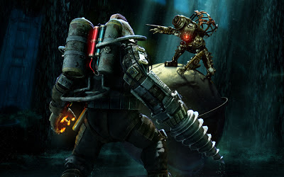
The scene is lite from various different light sources, but a blueish, green shade of light overcasts the whole image, from somewhere overhead. You can see the light traveling down in slanted 'columns', picking up individual droplets of water, coming down from the roof. There appears to somewhat of a spotlight highlighting the character crouched over the immense globe. I suspect this is an example of 'artistic license ', when given the improbability that a particularly strong group of rays are illuminating her, and not any other areas of the environment around her. But this is likely because the artist wants to draw attention towards this character, adding an air of theatricality and drama to the scene, with this 'spotlight'. There is also an unseen source of light somewhere off to the left of the scene, which is illuminating the detail found on the back of the character in the foreground. This is because this character is the protagonist of the game, and as such, is important. In addition, there is a thin band of white light, highlighting the edges of the protagonist's body, down the right side. This draws the viewer's eye to the helmet, the features of the right arm and the deadly-looking drill. Overall, the image is quite dark, and is bathed in cool colours, like blue and green. I believe this is done to reflect the dark mood of the piece , and also that the image connects with the underwater world 'Bioshock2' is set in. In contrast however, the foreground character wields fire in his left hand. This stark difference in colour is vastly opposed to the cold tones that surround it. This is turn, stands out, and creates a point of interest for the audience. However, I don't think that this intended to be the central focal point of the picture. The character in the background has a singular, glowing red view port on her helmet. This draws the audience into the frame, with it's vivid colour. It creates further focus upon the character, but also helps even out the focus between both of the characters in the scene. The red of her 'eye' is matched with the red tank on the protagonist's backpack. The use of the red on both characters helps forge a connection between the two. In context of the image, the artist wants to describe the similarity between the two enemies, and that they are both equally matched.
For the second image, I chose a piece of artwork from Games Workshop's Warhammer 40,000 universe. It is a piece of cover art for an alien, machine race called the Necrons. The piece is by artist Adrian Smith.
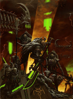
To begin, the artist makes heavy usage of the colour green. This is a common colour, classically associated with this particular race. This sickly shade of green emmanates from their weapons and devices, acting as a unifying colour across disparate elements in the picture. In particular, the central figure, who's long, staff-like weapon, has a glowing blade. The light from the blade is interacting very unusually with itself, and the elements around it. The metal of the blade itself appears to be dark and dull, and utterly unaffected by the light which is coming from it. Also, the light itself is very limited in it's dispersal. It seems to cling to the blade, and is not touching any surfaces nearby. These unusual features allude to the hyper-advanced, otherworldly ancient nature of the Necrons themselves. There are two great shafts of light originating from somewhere beneath the scene. One is just behind the figure in the center and the other is off to the right of the image, illuminating a skeletal foot solider. I think that this lights suggests at the immense power beneath the characters. In context of the scene, these Necron warriors are emerging from their tombs after aeons of slumber, ready to wreck carnage upon the galaxy. The forks of lightning in the background further emphasise the theme of power. They burst forth from a bruised, rust-coloured sky. Their light diffuses amongst the clouds, but becomes focused once it enters the clear atmosphere. The artist continues to attempt to draw focus towards the central character, by highlighting the scales of his 'cloak'. These segments look almost white, in comparison to the rest of the image. As this white tone hasn't been used in such concentration elsewhere in the picture, the viewer's eye is immediately drawn to it, and therefore the character himself.
I now understand that knowing how light and colour behave is an important aspect when it comes to producing realistic looking artwork. Having proper knowledge of such elements can make a good picture look great.


No comments:
Post a Comment